


15,893
Deliverd orders

Data visualisation is an important functional tool in statistics as it is used frequently in dissertations and research presentations. For UK students from fields like statistics, economics, and other social sciences, data visualisation assists in making the results easy to understand, substantiating theories or conclusions, and increasing interest.
Tools such as SPSS and R have been adopted as part of the curriculum in UK universities, the students can use data visualisation more efficiently in their dissertations. In this blog, we will briefly consider its use in statistical dissertations, reveal main mistakes, describe outstanding practices, and sum up the most popular tools.
An important component of any statistical analysis is the ability to represent results as clear and compact visualisations. This transforms immense and complicated data into graphic forms to help the readers grasp the major points at first glance. In a dissertation, it serves several important functions:
Large numbers of tables and raw data can be intimidating. It makes the data easier through the use of visuals such as charts, graphs, and heat maps. In a study published in The Journal of Statistics Education, it was discovered that graphical displays boosted the general understanding by 65%.
The use of graphics complements quantitative findings in a compelling manner. For example, scatter plots or regression graphs help to determine correlations between variables, thus supporting the thesis.
Visual content also has a long lasting effect as compared to plain text. Another research done at the University of Edinburgh reveals that readers tend to spend 30% more time reading papers where visuals are clear, meaning that visuals are highly essential in making the discussion interesting and easy to understand.
Despite its benefits, certain mistakes can lessen the effectiveness of data visualisation:
An excess of points, colours or different kinds of charts can mislead rather than help. For example, presenting simple proportions using a 3D pie chart is not only confusing but can also misguide the audience.
Another common error is the wrong choice of the chart type. For example, to use a pie chart as a means of portraying period data is misleading as pie charts are essentially used to illustrate the relative sizes. Such data can be better presented using line graphs or, better still, bar charts.
Slight changes in the position of axes or in actual sizes of the graphical axes can mislead someone. For example, when zooming in the y-axis to magnify the difference between two or more sets of data, it creates an impression to the reviewers that the result is more outstanding than it actually is.
It is important that visualisations should be designed and implemented in such a way that they can be accessed by all groups of people, including those with impaired vision. This means making sure that the colours used in a combination are visible by a colour-blind person and that the labels on the charts are purposely made clearer.
Also read: STATISTICS FOR BUSINESS 700007
To maximise the effectiveness of data visualisation in your dissertation, follow these best practices:
Most UK students prefer using SPSS due to its friendly user interface and the ability to achieve comprehensive statistical analysis. According to IBM SPSS Statistics, the utilisation of relationships between two variables and identifying trends with the help of SPSS can help in improving the visualisation of data. Other commonly used tools include R programming, Python, and Tableau.
Think about whether your audience is generally used to data visualisation or not. Use less complex and certainly less detailed graphics for non-professional reviewers, whereas more elaborated graphs might prove useful for professional ones.
Make sure that all axes, legends, and points are labelled identically, regardless of their orientation. Uncertainty in the use of labels is often observed in the course of reviewing articles and may cause misunderstandings.
Always present your data accurately. Manipulating scales or leaving out data points can be considered academic misconduct, which UK academic institutions take very seriously.
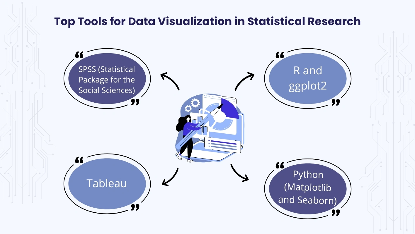
There are several tools commonly used for data visualisation statistics, but choosing the right data visualization tools for your dissertation is important, here are some tools, each with unique features suitable for dissertation writing:
SPSS is widely adopted at many universities across the United Kingdom; it is particularly useful for handling large data sets and creating a range of statistical graphs. It also supports integration with open-source tools such as R and Python for higher capabilities of visualisation. However, some of the features of SPSS include data manipulation and analysis, including regression analysis, time series analysis, and clustering among others.
If one wants more refined visuals, then R hardly disappoints with its flexibility. The package in R called ‘ggplot2’ allows users to make professional-looking graphics that allow the user full customization of the appearance of the chart, including the colour scheme and the axes on the graph.
This tool is particularly valuable for creating near real-time visualisation and dashboards. While being widely utilised in commercial applications, it is particularly suited for academic work due to its powerful data visualisation tools.
The Matplotlib and Seaborn libraries in Python are especially suitable for creating complex and elaborate visualisations. Another advantage is that Python also allows easy interfacing with statistical modelling packages thus making it convenient for students with large data sets.
Data visualisation plays an important role in the presentation of statistical analysis, especially in dissertations, where readability and information accuracy are most important. The UK especially maintains high standards in academics and thus, following high standards in data visualisation can greatly improve the quality of work. Software such as R, Python and SPSS statistics for data analysis and visualization help students to create excellent graphics that not only explain but also captivate the audience.
Choosing the right tools, avoiding mistakes, and using best practices can help you make your statistical dissertation stronger. Note that the process of data visualisation is not merely about making your research look pretty. It forms part of responsible presentation of your work to the public, and can be an excellent way of making your work stand out in the crowded world of contemporary academia.
Your First Order
Get 20% OFF!


© Copyright Quick Assignment Hub All rights reserved.
